NYSE Stock Analysis

Background
This time we are working with 508 New York Stock Exchange (NYSE)) stocks. We first conduct some simple exploratory analysis, and then chose 6 stocks of interest to show the relationship between their expected monthly returns and the risk to make a recommendation for choosing stock.
Load packages
library(tidyverse)  # Load ggplot2, dplyr, and all the other tidyverse packages
library(ggrepel) # To add text to plots
library(tidyquant) # To load stock prices and calculate returns
library(kableExtra) # For better table format
library(scales) # Show numbers in percentage
Data cleaning and exploring
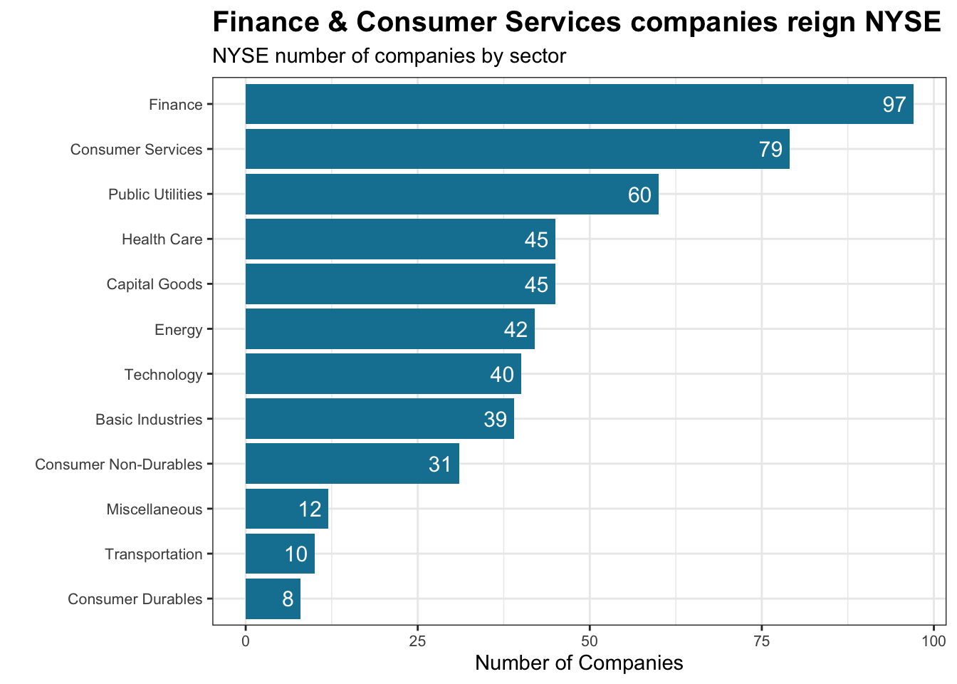
nyse <- read_csv(here::here("data","nyse.csv"))First let’s see how many companies are there in each sectors. we produce a bar plot showing the number of companies per sector, in descending order
companies_by_sector <- nyse %>%
  group_by(sector) %>%
  summarise(count = n())

ggplot(companies_by_sector, aes(x = reorder(sector, count), y = count)) +

  geom_col(fill = "#1380A1") +

  theme_bw()+
  theme(plot.title = element_text(face = 'bold', size = 15), # bold title, set text size
        axis.text.x = element_text(size = 8),
        axis.text.y = element_text(size= 8)) +

  geom_label(aes(label = count), # add label to each bar
             hjust = 1,
             vjust = 0.5,
             fill = NA,
             label.size = NA,
             color = 'White',
             size = 4) +

  labs(x = "",
       y = "Number of Companies",
       title = 'Finance & Consumer Services companies reign NYSE',
       subtitle = 'NYSE number of companies by sector') +

coord_flip() 
Analyse stock returns
Next, we choose 6 stocks of interest as well as SPY , which is SP500 ETF to analyse their returns. You can use tq_get() to get the stock prices from Yahoo Finance. We also specify our study period to be 2011-01-01 to 2020-08-31
myStocks <- c("JPM","DIS","DPZ","ANF","TSLA","XOM","SPY" ) %>%
  tq_get(get  = "stock.prices",
         from = "2011-01-01",
         to   = "2020-08-31") %>%
  group_by(symbol)

glimpse(myStocks) # examine the structure of the resulting data frame
## Rows: 17,017
## Columns: 8
## Groups: symbol [7]
## $ symbol <chr> "JPM", "JPM", "JPM", "JPM", "JPM", "JPM", "JPM", "JPM", "JP…
## $ date <date> 2011-01-03, 2011-01-04, 2011-01-05, 2011-01-06, 2011-01-07…
## $ open <dbl> 43.0, 43.8, 43.9, 44.4, 44.5, 43.3, 43.7, 44.4, 44.9, 44.5,…
## $ high <dbl> 44.0, 44.3, 45.0, 44.8, 44.6, 43.8, 44.0, 44.9, 45.0, 45.9,…
## $ low <dbl> 43.0, 43.3, 43.9, 44.2, 42.7, 43.0, 43.4, 44.2, 44.2, 44.5,…
## $ close <dbl> 43.6, 44.2, 44.7, 44.5, 43.6, 43.4, 43.6, 44.7, 44.5, 44.9,…
## $ volume <dbl> 43278500, 40036800, 50032500, 31606200, 69579400, 30098100,…
## $ adjusted <dbl> 33.0, 33.5, 33.9, 33.7, 33.1, 32.9, 33.1, 33.9, 33.7, 34.0,…Now we calculate the daily, monthly and yearly returns using tidyquant::tq_transmute And investigate their common statistics of monthly returns.
#calculate daily returns
myStocks_returns_daily <- myStocks %>%
  tq_transmute(select     = adjusted,
               mutate_fun = periodReturn,
               period     = "daily",
               type       = "arithmetic",
               col_rename = "daily_returns",
               cols = c(nested.col))

#calculate monthly  returns
myStocks_returns_monthly <- myStocks %>%
  tq_transmute(select     = adjusted,
               mutate_fun = periodReturn,
               period     = "monthly",
               type       = "arithmetic",
               col_rename = "monthly_returns",
               cols = c(nested.col))

#calculate yearly returns
myStocks_returns_annual <- myStocks %>%
  group_by(symbol) %>%
  tq_transmute(select     = adjusted,
               mutate_fun = periodReturn,
               period     = "yearly",
               type       = "arithmetic",
               col_rename = "yearly_returns",
               cols = c(nested.col))
#We group the monthly returns data by symbol, and create the summary variables in summarise, before arranging by mean in descending order
summary_monthly_stock_returns <- myStocks_returns_monthly %>%
group_by(symbol) %>%
summarise(min = label_percent()(min(monthly_returns)),
max = label_percent()(max(monthly_returns)),
median = label_percent()(median(monthly_returns)),
mean = label_percent()(mean(monthly_returns)),
SD = label_percent()(sd(monthly_returns))) %>%
arrange(desc(mean))
#We publish these results as a table
kbl(summary_monthly_stock_returns,
col.names=c("Stock Ticker",
"Minimum Monthly Returns",
"Maximum Monthly Returns",
"Median Monthly Returns",
"Mean Monthly Returns",
"Standard Deviation Monthly Returns ")) %>%
kable_styling()| Stock Ticker | Minimum Monthly Returns | Maximum Monthly Returns | Median Monthly Returns | Mean Monthly Returns | Standard Deviation Monthly Returns |
|---|---|---|---|---|---|
| TSLA | -22% | 81% | 1% | 5% | 17% |
| DPZ | -19% | 34% | 3% | 3% | 7% |
| DIS | -18% | 23% | 1% | 1% | 6% |
| JPM | -23% | 17% | 2% | 1% | 7% |
| SPY | -12% | 13% | 1% | 1% | 4% |
| ANF | -42% | 51% | 0% | 0% | 14% |
| XOM | -26% | 22% | 0% | 0% | 6% |
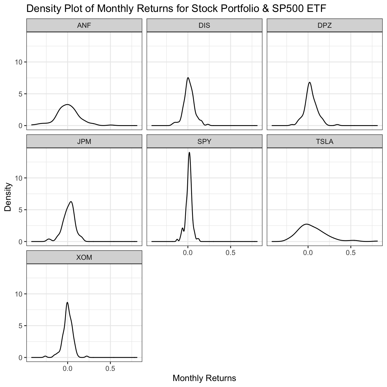
We now visualise the distribution of each stock’s monthly returns.
We can see that, the Tesla (TSLA) stock is most risky, since the distribution of monthly returns is widest, showing high variation. Further, it is skewed positively, meaning this variation falls around and below a return of 0.00%. While Abercrombie & Fitch Co. (ANF) may seem similarly risky, this shows a higher peak, and therefore a narrower distribution, meaning less variation in monthly returns. This means it is a more certain, or less risky, investment.
The least risky stock is Exxon Mobil (XOM), which has the highest peak of all the stock distributions. Despite being centred on a mode value of 0, as this has the narrowest distribution of monthly returns, it carries the highest certainty.
Though SP500 ETF shows the least risk of all the assets by far, with an extremely narrow distribution, it is an index, not a stock so this shouldn’t come as a surprise.
#We create a density plot, with appropriately labelled axes and an appropriate title, faceted by stock ticker
ggplot(myStocks_returns_monthly, aes(x=monthly_returns)) +
  geom_density() +
  facet_wrap(~symbol) +
  labs(x="Monthly Returns", y="Density", title="Density Plot of Monthly Returns for Stock Portfolio & SP500 ETF") +
  theme_bw()
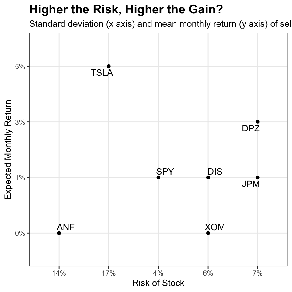
Finally, we make a plot that shows the expected monthly return (mean) of a stock on the Y axis and the risk (standard deviation) in the X-axis.
This plot demonstrates that there is a generally positive correlation between expected return (mean) and risk (standard deviation), which is to be expected since investors willing to take on greater risk expect a higher return for it, otherwise the risk is not worth taking on.
Yet, as we observed in the density plot above, while A&F has high variability in its monthly returns (it is risky), its mean monthly return is actually negative. This, like Exxon Mobil, contradicts the general observed relationship between risk (monthly price variation, SD) and mean return, by having higher-than-expected variation given its low (~0.00%) mean monthly return.
#We create a standard scatter plot, labelling axes appropriately
ggplot(summary_monthly_stock_returns, aes(x=SD, y=mean, label=symbol)) +

  geom_point(alpha=1) +
  geom_text_repel() +

  labs(x="Risk of Stock",
       y="Expected Monthly Return",
       title = "Higher the Risk, Higher the Gain?",
       subtitle = "Standard deviation (x axis) and mean monthly return (y axis) of selected stock and SPF500") +
  theme_bw() +
  theme(plot.title = element_text(face = 'bold', size = 15))
Details
Adapted from: Assignment from Applied Statistics with R, London Business School
Course Instructor: Kostis Christodoulou
Original assignment collaborated with: Study Group 11: Abhinav Bhardwaj, Alberto Lambert, Anna Plaschke, Bartek Makuch, Feiyang Ni